Components
DUSWDS components offer straightforward and consistent solutions for common user interface needs.
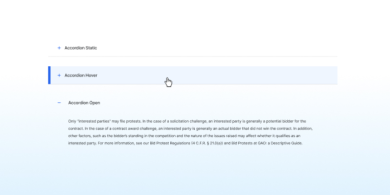
Accordion
An accordion is a list of headers that hide or reveal additional content when selected.
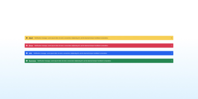
Alert
An alert keeps users informed of important and sometimes time-sensitive changes.
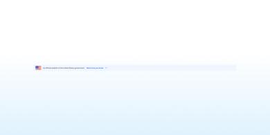
Banner
Banners indicate official websites of U.S. government organizations. They also help visitors determine if a website is legitimate and secure.
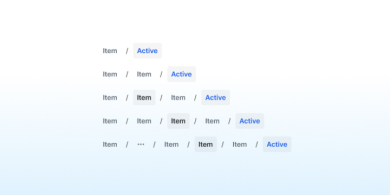
Breadcrumb
Breadcrumbs offer secondary navigation that helps users understand their location within a website.
Body Text
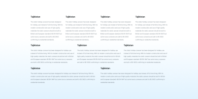
Body Text is the main content area of a webpage, which can be formatted into 1, 2, 3, or 4 columns.
Button
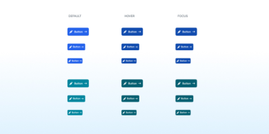
A button highlights important actions with a prominent, clickable surface and is often used as a call to action.
Button Group
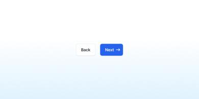
A button group organizes similar or related actions together
By The Numbers
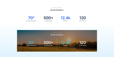
A "By the Numbers" component displays a few blocks with large numbers and brief descriptions beneath them, highlighting important statistics or data.
Calendar
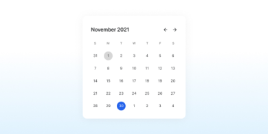
The Calendar component provides a visual representation of dates and events, allowing users to easily navigate and view scheduled activities.
Card
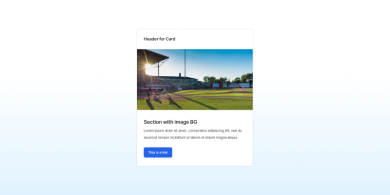
Cards present content and actions related to a single topic, and they come in a wide variety of configurations.
Carousel
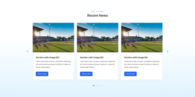
A carousel component lets users cycle through a series of images, cards or content panels, using navigation controls. It's ideal for showcasing multiple items in a compact space.
Checkboxes & Radios
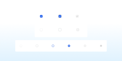
Checkboxes let users select one or more options from a list.
Radio buttons let users select exactly one option from a group.
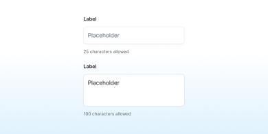
Character Count
Character count informs users of the remaining number of characters they can enter when a limit is set.
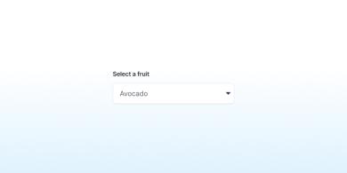
Combo Box
A combo box allows users to select an item from a large list of options.
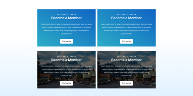
CTA
The CTA component is a card featuring a button that prompts users to take a specific action.
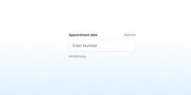
Date Picker
A date picker allows users to choose a specific date.
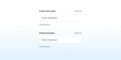
Date Range Picker
A date range picker enables users to select a period between two dates.
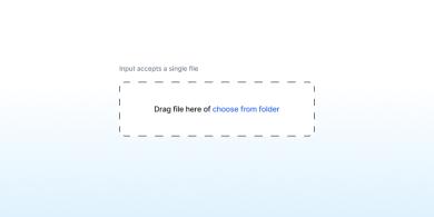
File Input
File input enables users to upload one or multiple files.
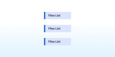
Files List
The Files List component displays a list of uploaded files, allowing users to view and manage attachments.
Footer
A footer assists site visitors who reach the bottom of a page without finding what they need.
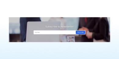
Forms
A form enables users to input information on a page.
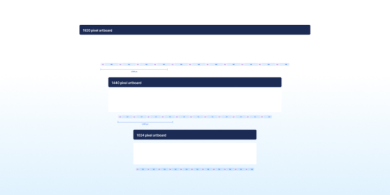
Grid
Use our flexible grid system to structure website content. The grid is based on a 12-column system and designed for desktop, tablet, and mobile devices.
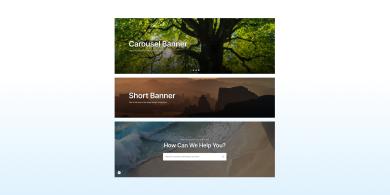
Hero Banner
A Hero Banner prominently displays key content on a website’s homepage, drawing users' attention to important information or features.
Icon List
An icon list enhances the meaning and visibility of each list item by including a leading icon.

Language Selection
The placement, interface, and behavior of the language selection component enable users to easily find and access content in their preferred language.
Link
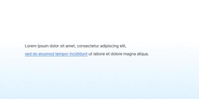
A link directs users to another page or additional information.
List
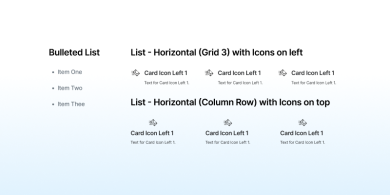
A list organizes information into discrete sequential sections.
Memorable Date
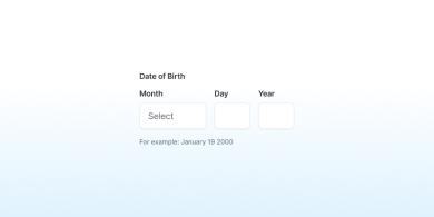
The easiest way for users to enter most dates is by using a month dropdown followed by two text fields.
Modal
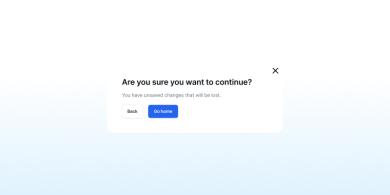
A modal disables the page content and directs the user's focus to a single task or message.
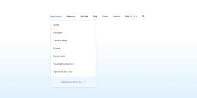
Navigation
Hierarchical, vertical navigation designed to be placed along the side of a page.
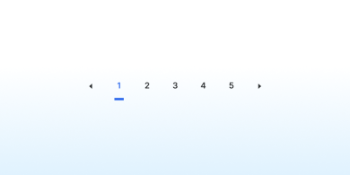
Pagination
Pagination provides navigation for content that is divided into multiple pages.
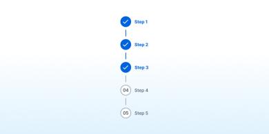
Process List
A process list outlines the steps or stages of important instructions or procedures.
Prose
Format a block of continuous text.
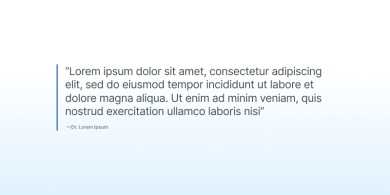
Pull Quote
The Pull Quote component highlights a significant quote or excerpt from the content, drawing attention to key information or impactful statements.
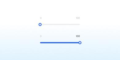
Range Slider
A range slider lets users select an approximate value within a specified range.
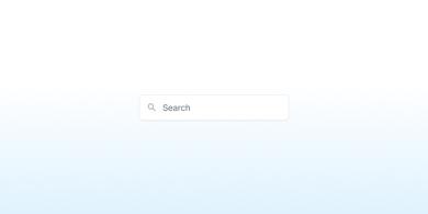
Search
Search enables users to find specific content by entering search terms, particularly if they can't locate the desired content through the main navigation.
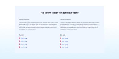
Summary Box
A summary box highlights key information from a longer page or outlines the next steps.
Switch
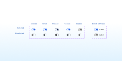
The Switch component allows users to toggle between two states, such as on/off or enable/disable, providing a clear and interactive way to change settings.
Tab
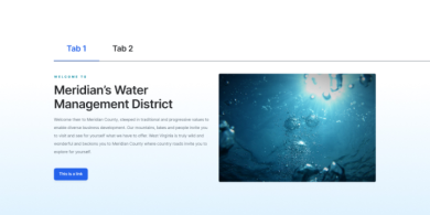
A Tab component organizes content into separate sections, allowing users to switch between them by clicking on tab labels.
Table
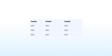
A table displays information in rows and columns.

Tag
A tag highlights new or categorized content elements.

Testimonial
The Testimonial component showcases quotes or feedback from satisfied users, providing credibility and social proof.
Text Fields
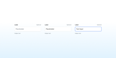
Text fields enable users to enter combinations of letters, numbers, or symbols. These input boxes can be single-line or multi-line.
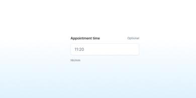
Time Picker
A time picker allows users to choose a specific time.
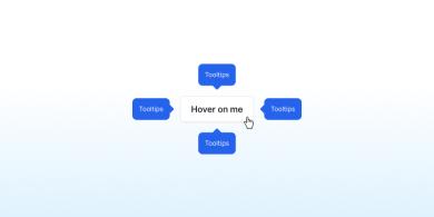
Tooltip
A tooltip is a brief descriptive message that appears when a user hovers over or focuses on an element.
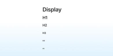
Typography
Government websites require clear and consistent headings, highly legible body paragraphs, precise labels, and user-friendly input fields. Our default typefaces are designed for readability and can adapt to various visual styles.
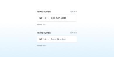
Validation
Presenting validation requirements upfront and providing live feedback ensures users are not left guessing.
The DUSWDS solution tailored to meet the specific requirements and challenges of the government sector, focusing on user experience, security, compliance, and functionality.
An accordion is a list of headers that hide or reveal additional content when selected.
Congress shall make no law respecting an establishment of religion, or prohibiting the free exercise thereof; or abridging the freedom of speech, or of the press; or the right of the people peaceably to assemble, and to petition the Government for a redress of grievances.
A well regulated Militia, being necessary to the security of a free State, the right of the people to keep and bear Arms, shall not be infringed.
- This is a list item
- Another list item
Guidance
When to use the accordion component
If users will only need a few specific pieces of content within a page.
If you have only a small space to display a lot of content.
When to consider something else
If users need to see most or all of the information on a page. Use well-formatted text instead.
If there is not enough content to warrant condensing. Accordions increase cognitive load and interaction cost because users have to make decisions about what headers to click on.
Usability guidance
Make the entire header selectable. Allow users to click anywhere in the header area to expand or collapse the content; a larger target is easier to manipulate.
Give interactive elements enough space. Make sure interactive elements within the collapsible region are far enough from the headers that users don’t accidentally trigger a collapse. (The exact distance depends on the device.)
Accessibility guidance
Code header areas in the accordion as buttons. Using a <button type="button"> assures accordions are usable with both screen readers and keyboards.
Use meaningful expansion button labels. Aim for informative labels like “Explore federal compliance checklists” rather than vague ones like “Click here.”
Use aria-controls to associate an accordion button with its related content. Connect an accordion button control with its appropriate content region by referencing the controlled element’s id in the button’s aria-controls attribute.
Use unique ids. Each button has a unique name, aria-controls="[id]", that associates the control with the appropriate region by referencing the controlled element’s id.
Accordions use javascript to set the hidden values of their content areas. Each content area will have its hidden attribute set by the component, depending on its corresponding button’s aria-expanded attribute. To ensure your content is accessible in the event that the JavaScript does not load or is disabled, you should not manually set hidden on any of your content areas.
You do not need to add text alternatives for the collapsed and expanded accordion states. These states are set programmatically with JavaScript.
Using the accordion component
Multiselectable accordion groups. Add the data-allow-multiple attribute to any usa-accordion to create a multiselectable accordion group.
Default an accordion button to open. Add the aria-expanded="true" attribute to any usa-accordion__button to have that section open by default at page load. When the accordion is initialized, the JavaScript will automatically add aria-expanded="false" attribute to all other accordion buttons.
Banner
Banners identify official websites of government organizations in the United States. They also help visitors understand whether a website is official and secure.
About the banner component
You should use the banner to identify your site as an official government site.
The banner explains how to identify an official .gov or .mil domain and that these sites have secure HTTPS connections. Using the banner component is the best way to assure visitors that they’re connected to an official site.
Most government sites should use the banner, but some should not use the banner. Do NOT use the banner on non-government domains such as a .com or .org.
If you are unable to update to USWDS 2.8.0 (described on GitHub) or higher but still want to include the new language in your banner, we recommend editing your content to the language outlined in the component preview.
Guidance
When to use the banner component
To identify as an official government site. Most government sites should use the banner.
When to consider something else
If you don’t use a .gov/.mil domain and HTTPS. The Design System’s banner text identifies .gov and .mil domains and HTTPS as indicators that a website is an official government website. Use this banner only if your site uses both the proper top-level domain (TLD) and HTTPS.
Any time it would be misleading. The banner should be used to reduce confusion. Avoid using the banner on any site meant only for testing or otherwise not meant to be identified as an official government website.
Usability guidance
Use the provided text without customization. The banner is most effective as an identifier and a learning tool when its message is consistent across government sites. With only a few exceptions (described in our Implementation guidance), sites should use the TLD-appropriate text provided, unaltered. Use the Spanish version of the banner for Spanish-language websites.
Use the version appropriate to your website’s TLD. If your project uses a .mil top-level domain, use the .mil banner text.
Show the banner on every page. Use the banner at the top of every page of a site. It can be confusing or misleading if it appears on some pages and not others.
Avoid distraction. The banner should appear on every page of your site. Choose background colors that fit with your site theme, and avoid color combinations that draw excessive attention to the banner.
Keep the text up to date. Use the most current version of the banner.
Breadcrumb
Breadcrumbs provide secondary navigation to help users understand where they are in a website.
About the breadcrumb component
A breadcrumb bar shows the location of the current page in the site structure. It’s like a path from the current page back to the home page, showing each level of organization in-between. Breadcrumbs allow a user to navigate “up” to a parent section instead of “Back” to the previous page. Use breadcrumbs to help users navigate and understand the organization of your site.
Guidance
When to use the breadcrumb component
When orientation matters. Breadcrumbs show where the current page is located in the website hierarchy. Use a breadcrumb when it’s likely that a user will arrive at an interior page from search or from an outside link.
To facilitate navigation. Breadcrumbs make it easier to understand complex sites. Use breadcrumbs to reinforce your site’s structure.
When to consider something else
Simple sites. If the website is not very deep and the context for the current page is clear from the main navigation.
Landing pages. Omit breadcrumbs on the homepage of a site. Breadcrumbs could also be omitted from section landing pages. Breadcrumbs are most useful when the hierarchy is not immediately apparent from the main navigation.
Redundant side navigation. When side navigation is used in combination with main navigation, it may be redundant to include breadcrumbs.
Step-by-step processes. Use breadcrumbs for hierarchical relationships, not linear relationships (like individual steps in a multi-step process).
Usability guidance
Consider alternatives to wrapping. In general, rely on truncating the title of the current page over wrapping breadcrumb text. But usability comes first. Consider alternative approaches if the title of the current page is completely truncated. For example, a mobile-friendly breadcrumb may show only a page’s direct parent. Sites with very long breadcrumb trails might ultimately need to wrap breadcrumbs, or consider flattening the information architecture of the site.
Use complete page titles. Use the same wording in breadcrumb text as in the page title.
Start with the word “Home”. Rather than using a house icon, spell out the word “Home” as the first link in the breadcrumbs.
Consider size of tap targets on small widths. Although breadcrumbs are frequently displayed using smaller text, make sure the text is not too small to select at small widths.
Optimize for search engines. To be eligible for rich results display in search engine results, mark up your site’s breadcrumbs using JSON-LD (recommended) or RDFa.
Accessibility guidance
Use the nav element. This allows assistive technology to present the breadcrumbs in context as a navigational element on the page.
Treat separators as text when it comes to contrast. Use separators that have AA contrast against their background.
Use ordered lists and list items. Use an ol for breadcrumbs and an li for each item. This allows assistive technology to enumerate the items in the breadcrumbs and allows shortcuts between list items.
Use ARIA markup for additional context. Use aria-label="Breadcrumbs" on the main element and aria-current="page" on the current page.
Hide separators from screen readers. The separators between links in the breadcrumbs should not be read by screen readers.
Calendar
A button group collects similar or related actions.
Lorem ipsum dolor sit amet, consectetur adipiscing elit. Proin non elit nisi. Interdum et malesuada fames ac ante ipsum primis in faucibus. Aliquam erat volutpat. Nam ut dolor vel sem ultricies aliquam. Ut volutpat dolor risus, sit amet maximus mi rhoncus nec. Aenean aliquet eros sit amet nulla vestibulum, in tristique nibh pretium. Aliquam facilisis ultrices massa eu pulvinar.
Button
A button draws attention to important actions with a large selectable surface.
Guidance
When to use the button component
Important actions. Use buttons for the most important actions you want users to take on your site, such as Download, Sign up or Log out.
When to consider something else
Linking between a site’s pages. Use regular links instead.
If the action is less popular or less important. Less popular or less important actions may be visually styled as links.
Usability guidance
Use standard buttons for actions that go a next step.
Use outline buttons for actions that happen on the current page.
Give an important action a distinctive style. Style the button most users should select in a way that distinguishes it from other buttons on the page. Try using the usa-button--big variant or the most visually distinct color variant.
Make sure buttons look selectable. Use color variations to distinguish static, hover, and active states.
Avoid using too many buttons on a page.
Use sentence-case capitalization for button labels.
Keep button text short. Button text should be as short as possible with action words that clearly explain what will happen when the button is selected (for example, Download, View, or Sign up).
Lead with a verb. Make the first word of the button’s text a verb. For example, instead of Complaint filing, label the button File a complaint.
Icons can be helpful. Consider adding an icon to signal specific actions (Download, Open in a new window, etc).
Grid
Use our flexible grid system to structure website content. The grid is mobile-first, powered by flexbox, and based on a 12-column system.
How it works
The grid system uses a series of containers, rows, and columns to lay out and align content. The following row and corresponding code are an example of and in-depth look at how the grid comes together.
This example code creates three equal-width columns on tablet, desktop, and widescreen devices by using our predefined grid classes. Those columns are centered in the page with the parent grid-container container.
The following sections break the layout grid down and describe how it works.
Containers, rows, and columns
Containers: grid-container centers the container and gives it a maximum width of desktop (1024px). If you would like the grid to span the full width of the page, do not use grid-container.
- grid-container can also accept any breakpoint width, like tablet-lg or widescreen. Set the default max width with $theme-grid-container-max-width in your USWDS settings configuration using unit tokens.
- By default, grid-container has a padding-x of 2 units at narrow widths, and a padding-x of 4 units at desktop and wider. Control these values by customizing $theme-site-margins-mobile-width, $theme-site-margins-width and $theme-site-margins-breakpoint in your USWDS settings configuration using unit tokens.
Rows: Columns must have a grid-row as a parent.
Columns: grid-col-[1-12] indicates the number of columns the item spans out of a possible 12 per row. So, if you want three equal-width columns across, use grid-col-4 for each item.
Additional functionality
Equal-width columns: With flexbox, grid columns without a specified width will display as equal-width columns. For example, four instances of grid-col will display as one-quarter-width columns across all sizes. Refer to the auto-layout columns section for more examples.
Gutters: Rows and columns don’t have any gutters by default, but gutters can be added by including grid-gap-sm, grid-gap, or grid-gap-lg at the row level. Refer to gutters for more info.
Media queries: Grid breakpoints are based on minimum-width media queries, meaning they apply to that specific width and all greater widths (e.g., tablet:col-4 applies to tablet, desktop, and widescreen devices but not at mobile-lg or any width below the tablet breakpoint). Refer to responsive variants for a full list.
Sass mixins: You can use predefined grid classes (like grid-col-4) for presentational markup or Sass mixins for more semantic markup.
By the numbers
A button group collects similar or related actions.
Lorem ipsum dolor sit amet, consectetur adipiscing elit. Proin non elit nisi. Interdum et malesuada fames ac ante ipsum primis in faucibus. Aliquam erat volutpat. Nam ut dolor vel sem ultricies aliquam. Ut volutpat dolor risus, sit amet maximus mi rhoncus nec. Aenean aliquet eros sit amet nulla vestibulum, in tristique nibh pretium. Aliquam facilisis ultrices massa eu pulvinar.
Tab
A button draws attention to important actions with a large selectable surface.
Lorem ipsum dolor sit amet, consectetur adipiscing elit. Proin non elit nisi. Interdum et malesuada fames ac ante ipsum primis in faucibus. Aliquam erat volutpat. Nam ut dolor vel sem ultricies aliquam. Ut volutpat dolor risus, sit amet maximus mi rhoncus nec. Aenean aliquet eros sit amet nulla vestibulum, in tristique nibh pretium. Aliquam facilisis ultrices massa eu pulvinar.
Card
About the card component
A card is often a subset or summary of a larger idea. It acts as an entry point to more detailed information. This summary can contain a variety of content types, such as text, images and multimedia, or buttons and links.
An individual card is typically a member of a collection of similar cards, not a single card in isolation. A card is distinguished from others in its collection by its content, and cards are distinguished from the broader page context in form usually with a border or a shadow.

Carousel
Lorem ipsum dolor sit amet, consectetur adipiscing elit. Mauris sed risus efficitur, fringilla orci id, consequat mi. Etiam lobortis eleifend tempus. Sed semper aliquet vulputate. Nulla et egestas enim.
Navigation
Lorem ipsum dolor sit amet, consectetur adipiscing elit. Mauris sed risus efficitur, fringilla orci id, consequat mi. Etiam lobortis eleifend tempus. Sed semper aliquet vulputate. Nulla et egestas enim.
Checkbox and Radios
Checkboxes allow users to select one or more options from a list.
About the checkbox
Checkboxes are an easily understandable way to indicate that users can select one or more answers to a question or items from a list. They’re always followed by a label or instructions that clearly indicate what checking the box represents.
Radio buttons allow users to select exactly one choice from a group.
About the radio buttons
Radio buttons are a common way to allow users to make a single selection from a list of options. Since only one radio button can be selected at a time (within the same group), each available choice must be its own item and label. In contrast, checkboxes may show a single label, with the checked/unchecked status of the item meaning opposite things. For example, a checkbox could have a single input/label and legend that says “I have read the terms and conditions.” Radio buttons would need two inputs/labels for the same legend, “No” and “Yes”.
Switch
Lorem ipsum dolor sit amet, consectetur adipiscing elit. Mauris sed risus efficitur, fringilla orci id, consequat mi. Etiam lobortis eleifend tempus. Sed semper aliquet vulputate. Nulla et egestas enim.
Pagination
Pagination is navigation for paginated content.
Text Fields
Lorem ipsum dolor sit amet, consectetur adipiscing elit. Mauris sed risus efficitur, fringilla orci id, consequat mi. Etiam lobortis eleifend tempus. Sed semper aliquet vulputate. Nulla et egestas enim.
Footer
A footer serves site visitors who arrive at the bottom of a page without finding what they want.
Text Headings
H2
H3
H4
H5
H6
Paragraph
Learn more about DUSWDS
DUSWDS is a CMS for federal government websites built on the powerful Drupal platform. DUSWDS is aligned with the USWDS design standards, ensuring your federal government website has the functionality your agency requires and meet the design guidelines established by the USWDS.
Generate a Demo now